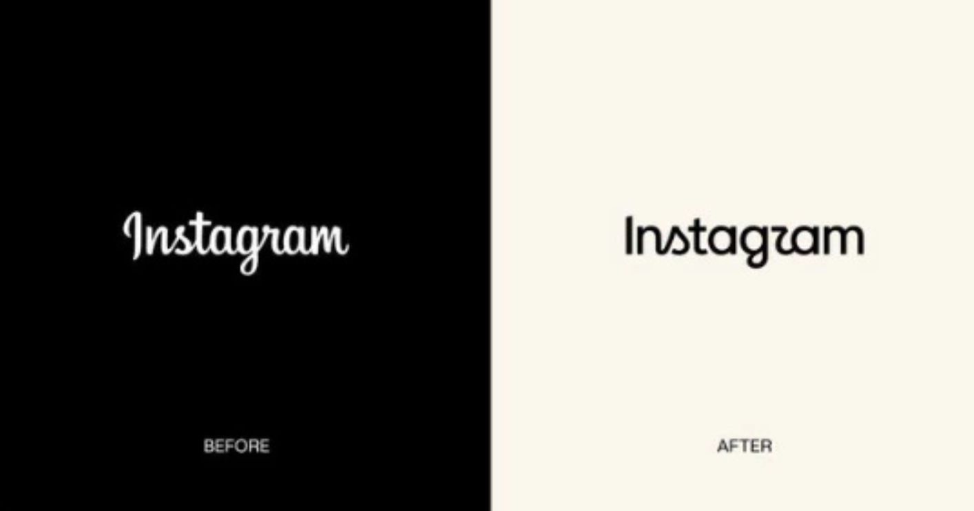
Instagram has given its wordmark a fresh look, marking a notable change to the way the platform displays its name. The new design uses a more contemporary font instead of the flowing script that had been part of Instagram's visual identity for nearly a decade.
Instagram CEO Adam Mosseri announced the change on Threads, describing the previous design as dated and saying the company wanted something more modern. The updated wordmark is now visible in parts of the Instagram app, including the area at the top of the interface.
WHY IS GEN Z BEING BLAMED?
The redesign quickly triggered a different conversation online.
Some users on X jokingly suggested that Instagram had abandoned cursive because younger people, particularly Gen Z, may be less familiar with the writing style.
The theory gained traction because cursive has become less common in parts of the US education system. However, there is no indication from Instagram that Gen Z's ability to read cursive was behind the redesign. The connection appears to have originated from social media users reacting to the new look.
Some users welcomed the change, while others joked that cursive had effectively become an old-fashioned form of writing that younger generations might struggle to recognise.
THE CURSIVE CONTROVERSY IN THE US
The discussion has also brought attention to the decline of cursive instruction in American schools.
The US Common Core standards introduced in 2010 did not make cursive handwriting a mandatory requirement. Digital and keyboard-based skills received greater emphasis instead.
A Docusign survey cited in the online discussion found that 51% of Gen Z respondents in the US said they could sign their name in cursive, compared with 80% of baby boomers.
Cursive instruction has since returned to classrooms in a number of US states, although its status differs across the country.
The situation is different in India, where cursive handwriting remains part of teaching in many schools.
SOME USERS THINK THE NEW DESIGN IS CONFUSING
The new wordmark has also attracted criticism for another reason: some people say the lettering itself is difficult to interpret.
Several users have pointed out that the redesigned “r” can look similar to a “z”, prompting jokes that Instagram has effectively become “Instagzam”.
Others compared the new lettering to the branding of a skincare company or other consumer brands.
The reactions have turned what was intended as a relatively subtle branding update into a lively social media debate.
INSTAGRAM'S LAST BIG BRANDING OVERHAUL
The latest change concerns Instagram's wordmark, rather than its familiar app icon.
Instagram's last major logo transformation came in 2016, when the company replaced its old three-dimensional camera graphic with the colourful gradient design that remains in use today.
The new wordmark represents a separate evolution of the brand's visual identity.
For Instagram, the objective appears to be straightforward: move away from an older typographic treatment and adopt a cleaner, more contemporary appearance.
For users, however, the redesign has opened up a much bigger debate — about fonts, nostalgia, cursive writing and whether younger generations can still decipher the handwriting style that was once considered standard.